Approaches to mobile web design have come and gone. Early on, it was necessary to build completely separate sites for the much less capable mobile devices of the time. Due to limitations in their browsers, they just weren’t capable of displaying a standard desktop site. As time passed, and mobile browsers improved, this became less and less true.
Today, there are few limitations upon what is possible in a mobile website. The aim now is to provide a single website to all devices, reducing the time invested in managing different sites and duplicate content.
Enter responsive design.
The principle is simple. When a visitor opens your site, detect the space available and adjust the appearance of the content to suit. In its simplest form, this is achieved by providing different designs for common device widths. In web design terminology, these widths are known as “breakpoints”.
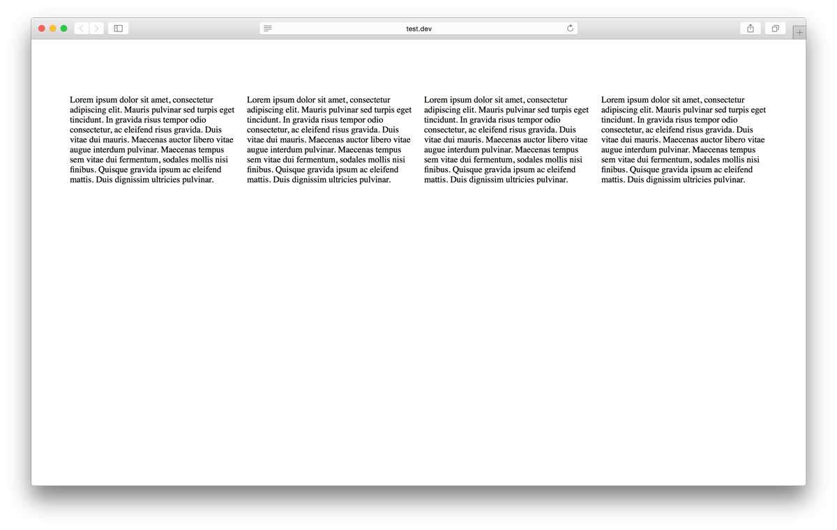
Let’s look at an example. Here we have a simple website with four boxes next to each other, displayed on a desktop computer:
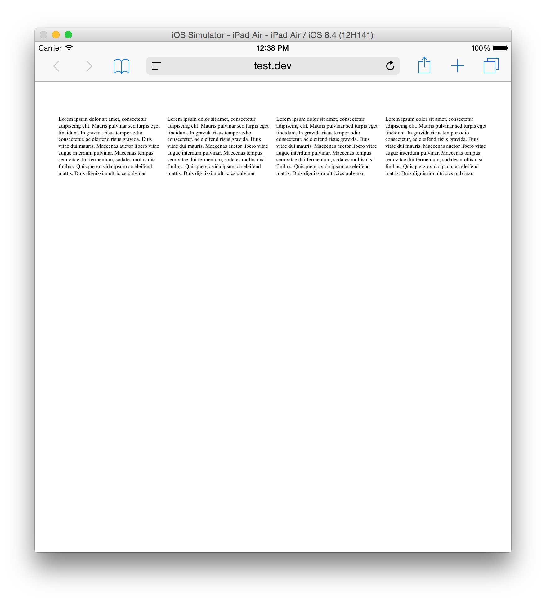
All is well with the world (if a little dull). However, let’s look at it on an iPad:
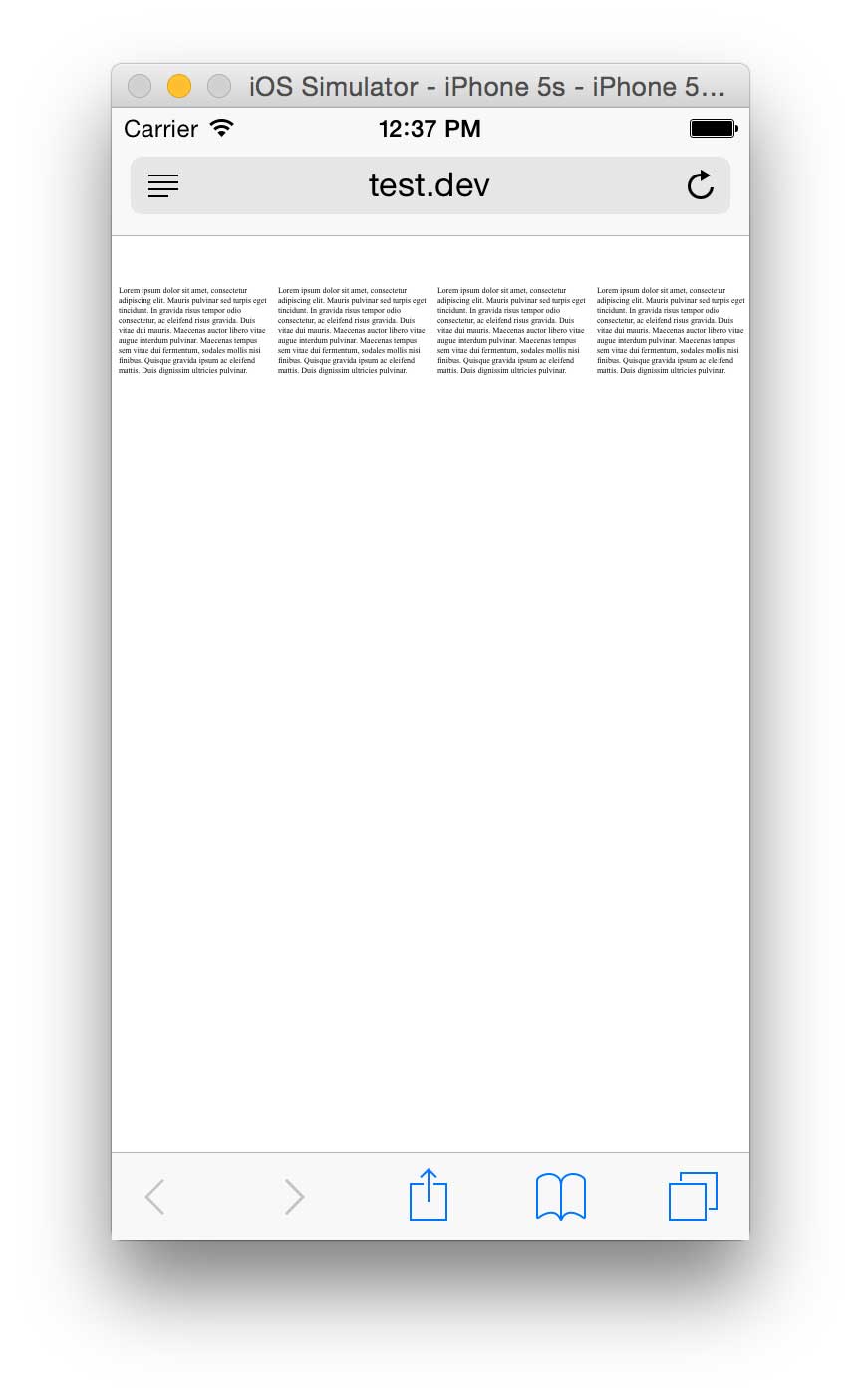
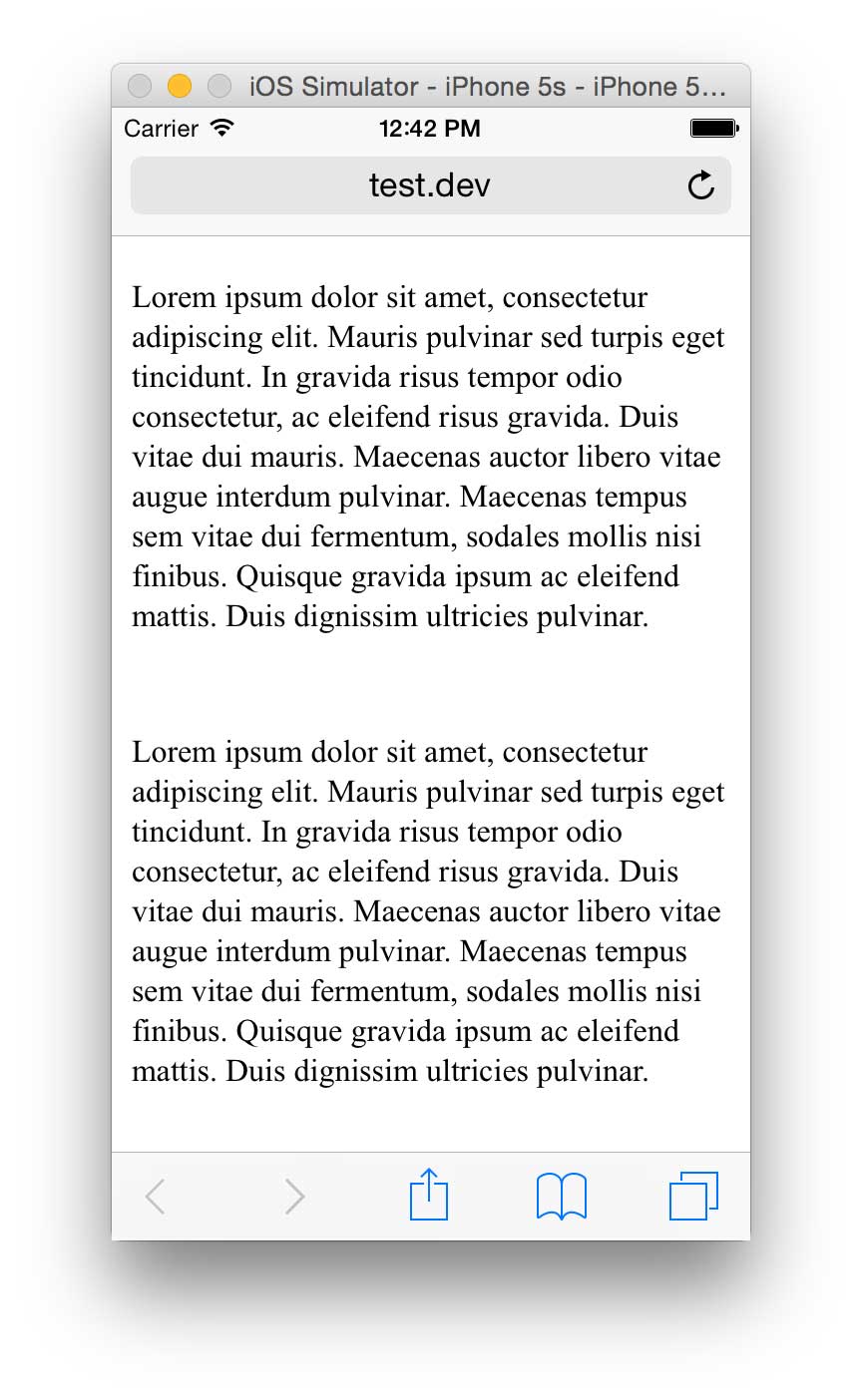
Things get even worse on an iPhone:
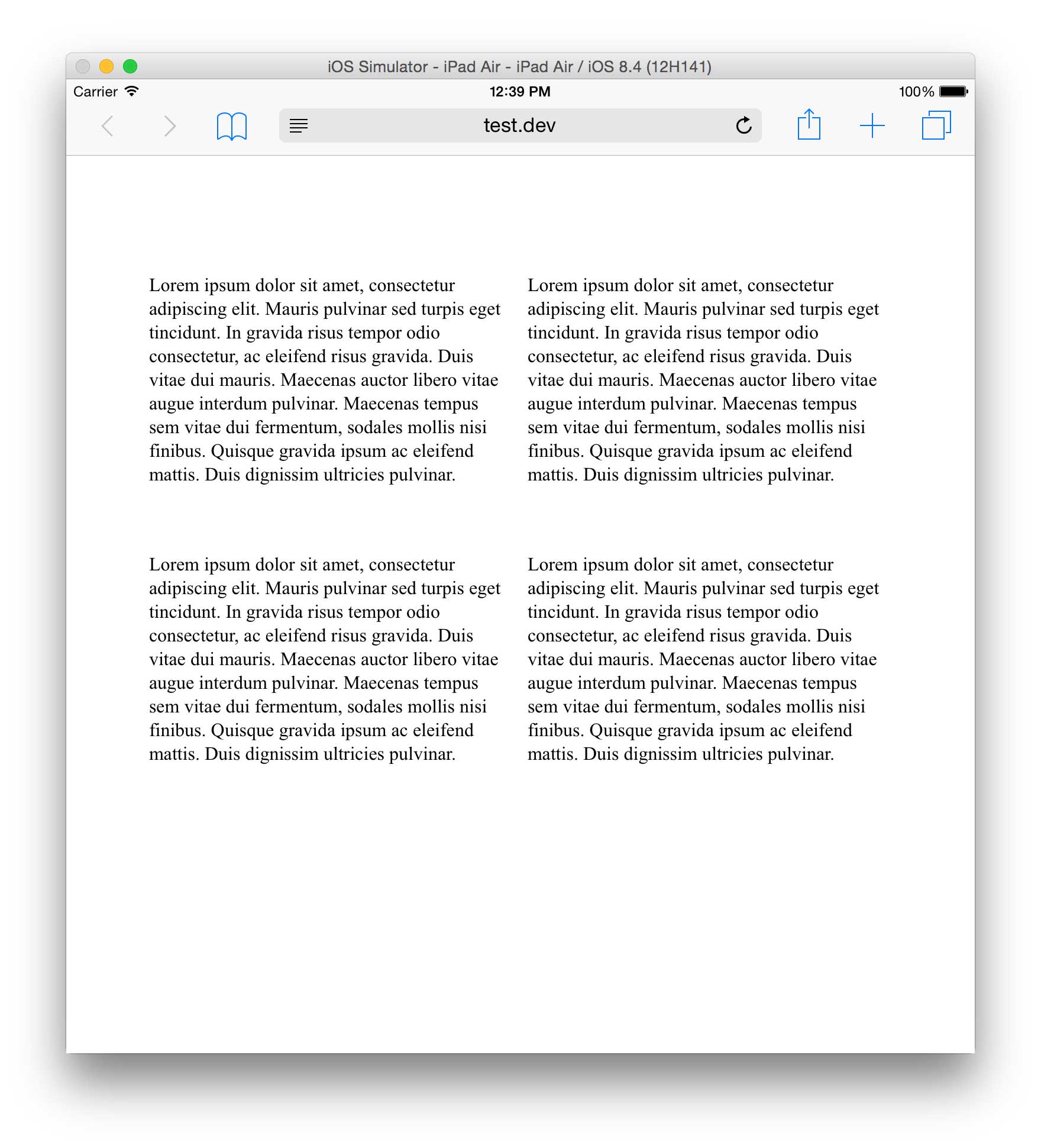
With responsive design, we can easily improve things by defining different layouts at appropriate breakpoints for the two devices. For the slightly reduced width available on the iPad, we can move the four content boxes into two rows of two:
For the much-reduced width available on the iPhone, we move all four boxes into a single column:
This is, of course, a simplistic look at responsive design, but many of the techniques are just variations of the premise. Design your site and change the layout at breakpoints so that your design is better suited to the device used to view them.
Freeway and Responsive design
While it has been possible to create mobile-aware websites in previous versions, Freeway 7 introduces a raft of functionality to make Responsive design a core component of the application. Primary among these is the Media Type bar:
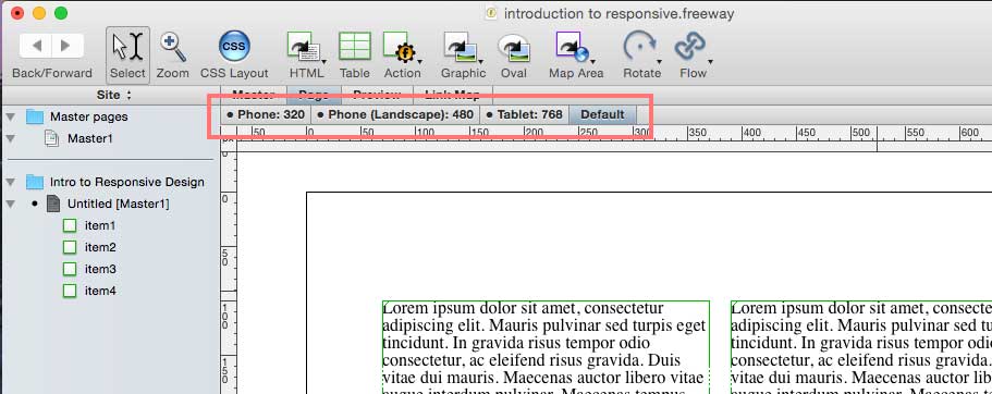
Each tab in this bar represents a media type, usually a breakpoint, at which you can change the appearance of items in the page, or indeed the page itself.
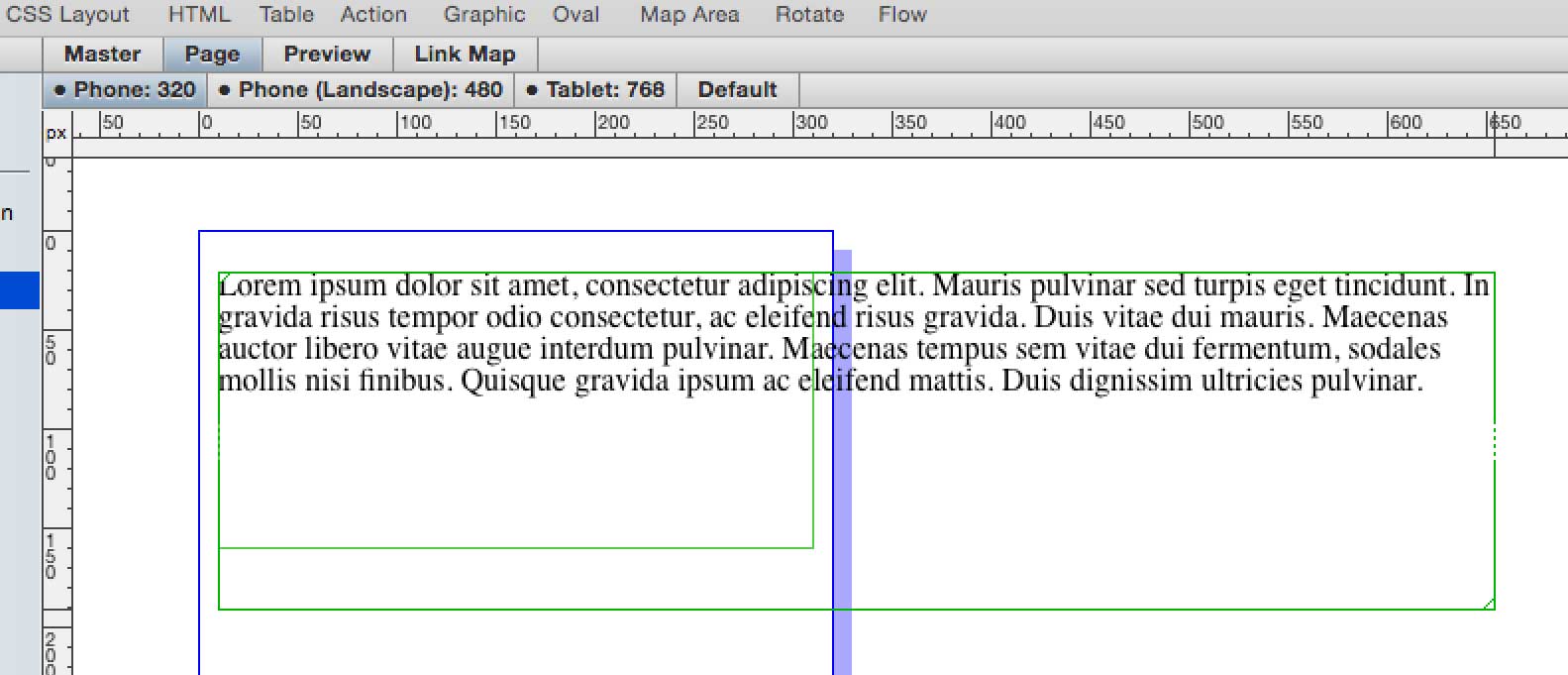
To do this, select the tab you want to edit, and then make changes just as you would in previous versions of Freeway. For example, to make the width of an item smaller when it’s viewed on phones, select the Phone: 320 tab, and then drag the width of the item smaller:
Of course, this change could also be made in the Inspector palette.
As you switch between the different media types in your site, Freeway will display the current state of your page and items for the current media type in the main layout view.
It is important to be able to see how settings have changed in the different media types, so there are a number of ways in which Freeway makes this information available.
Firstly, if any settings have been changed for any objects in particular media type, its tab in the Media Type tab bar will display a filled circle.
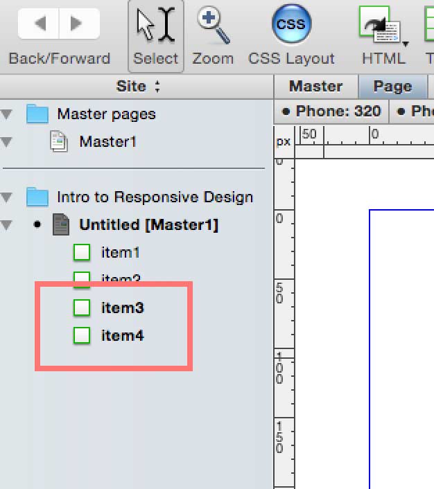
Secondly, objects which have had properties changed in the current media type will have their name drawn in bold text in the Site Panel:
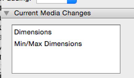
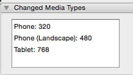
Finally, the Inspector palette has two new sections that show how properties for the currently selected object differ; they even allow you to delete the changes you have made to your objects.
The Current Media Changes section shows which settings have changed in the currently selected media type:
The Changed Media Types section shows which media types the currently selected object has changed in:
It’s also possible to change the media types defined for your site in the Edit Media Types dialog:
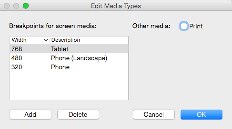
Here you can define the widths for the breakpoints appropriate for your site, and give them a descriptive name, if you so wish. The default set of breakpoints are based on the most common device sizes, so should fit the requirements of most sites.
Styling
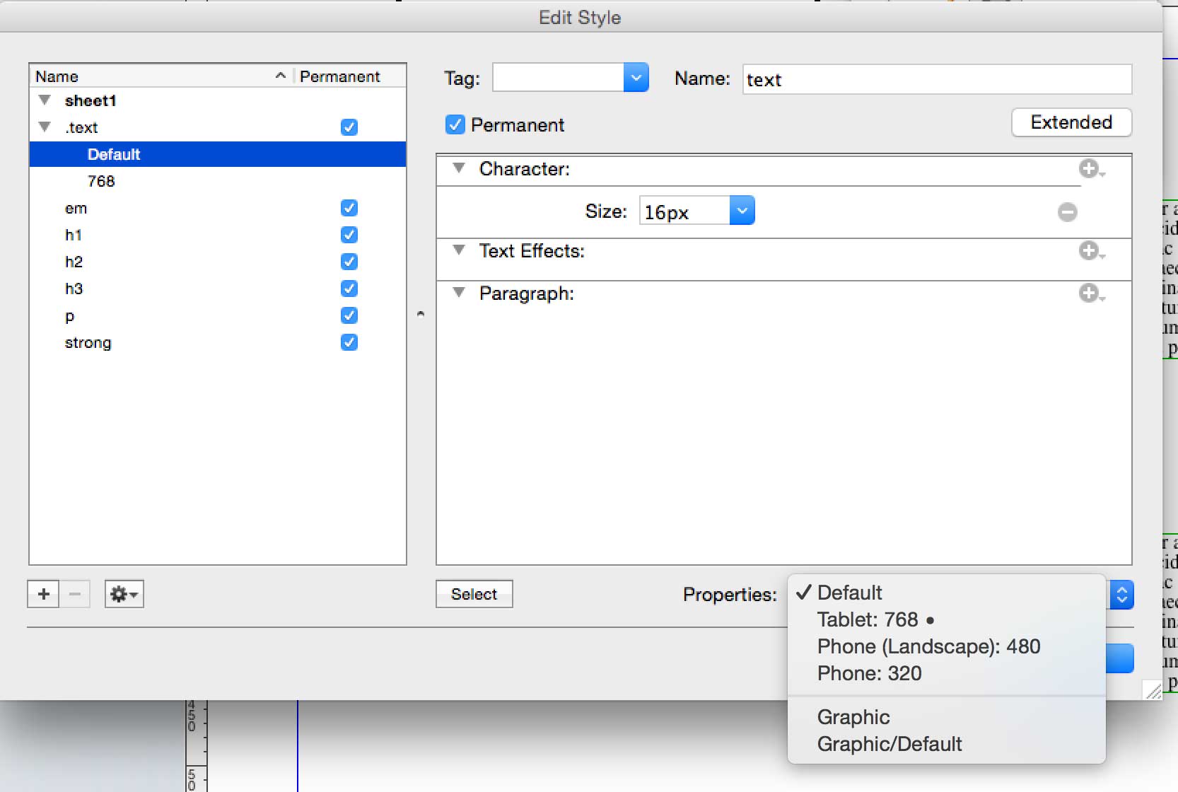
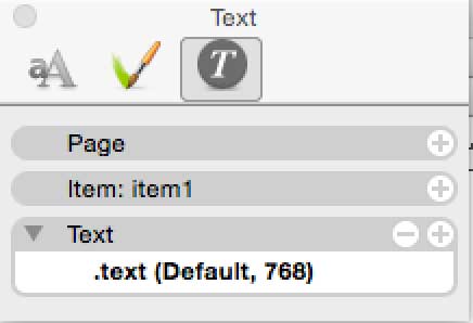
It’s now possible to change the appearance of text between breakpoints. When you open the Style Editor (Edit>Styles) you will see a list of the styles in your site on the left. If any of the styles have breakpoint changes, they’ll be listed and indented under the style name. You can see below that the “text” style has a size set in Default, and, because 768 is listed, something is also set in 768. You’ll also notice that there’s a filled circle alongside Tablet: 768 in the Properties popup at the bottom right:
To edit styles at different breakpoints you can either select the breakpoint from the Properties popup that can be seen in the above screenshot or by switching to a breakpoint, selecting the text you want to edit, and clicking on the style in the Styles Inspector. The Styles Inspector also displays the breakpoints that have been edited:
When looking at style breakpoints in the Edit Styles dialog it's worth noting that you won’t see the properties that have been selected in the larger breakpoints. If you create a style with a default font size of 20px and then switch down to Tablet: 768 breakpoint, the font size won’t be displayed. If you want to change it you’ll need to add it using the usual method of selecting it from the + icon on the right.
For more information on changing styles between breakpoints, see the Changing style attributes at breakpoints article.
Some important details
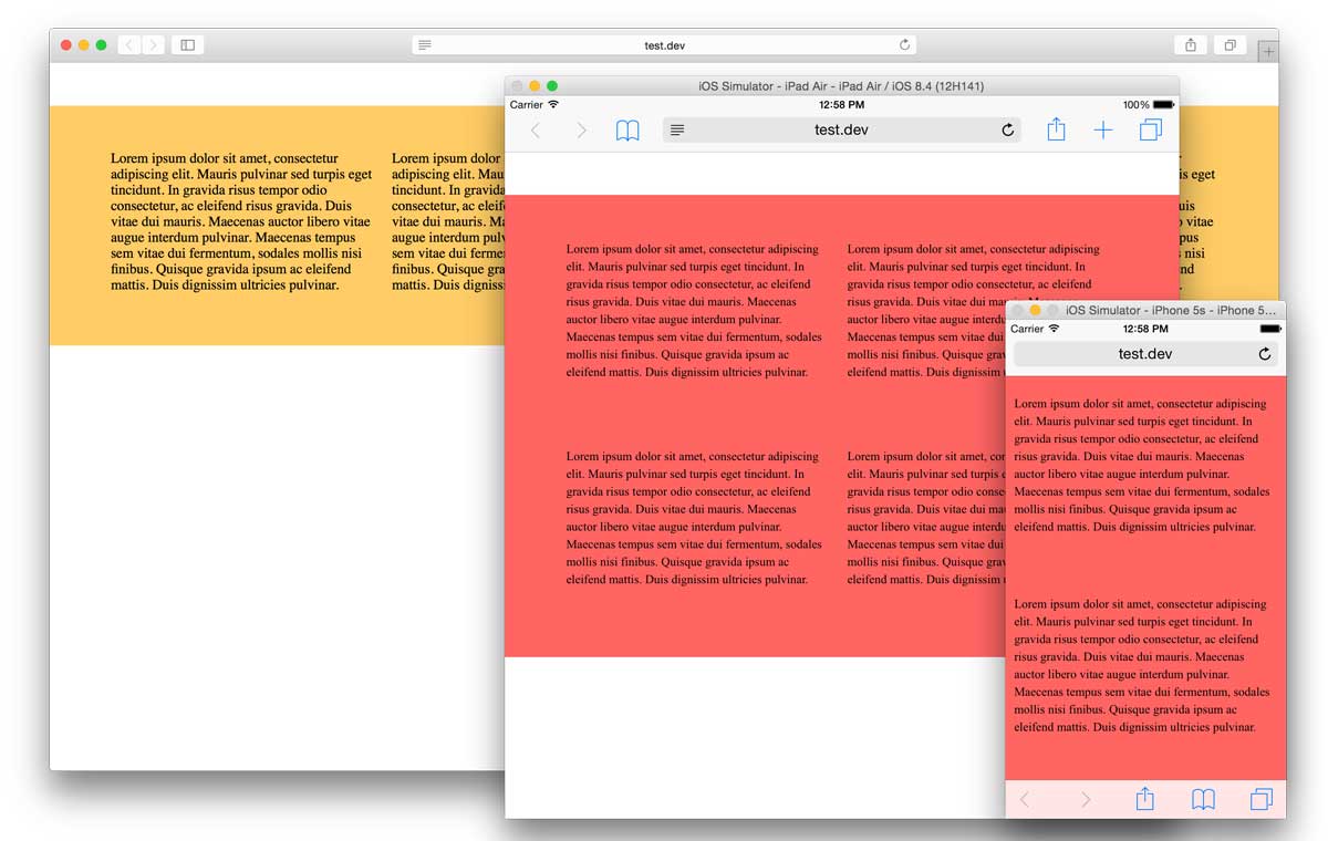
The widths defined for your breakpoints are maximum widths. This means that design changes made for a breakpoint are not just changes for that specific width – they are changes that will affect all devices with screens of that size or smaller.
For example, if you give a yellow item in your site a background color of red at the Tablet: 768 breakpoint, all devices that have a screen width of 768 pixels or less will display the item as red.
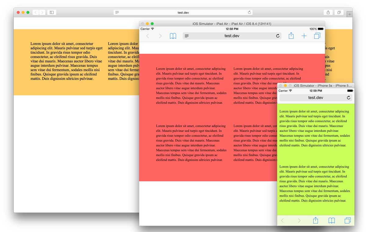
This does not stop you from changing the color at another breakpoint – if you were to change the color of the item to green for the Phone: 320 breakpoint, the item would display as green on devices with a screen width of 320 pixels or less:
The last thing that’s important to note in this introduction – responsive design works by making changes to the styling of items at different breakpoints. This means that changes to content and structure will affect all breakpoints, not just the current and smaller ones. As a result, the content of all items, any type of table-based item (HTML, graphic, pass-through), and map areas cannot be changed at all at specific breakpoints.
Graphic items and CSS-based tables can be repositioned, but not resized. CSS-based HTML items and pass through graphic items can be repositioned and have different settings in the Inspector palette at multiple breakpoints. For a full list of what can and can’t be changed, please refer to this article. For a brief visual overview of the above, watch our Getting Started video.
A final word
Freeway 7’s new responsive capabilities will allow you to take your desktop designs and enhance them to work as well on mobile devices as they do on desktop computers. No matter how you create your site, be it by simply drawing items on your pages, or by using Freeway’s advanced in-flow layout functionality, responsive design is now simple to integrate into your existing workflow.