What is this responsive web design thing?
Responsive web design as a principle is really quite simple – it’s making sure a site fits the device it’s viewed on.
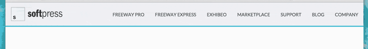
Take a look at the Softpress site right now. If you’re on a desktop, resize the browser window so it’s narrower and you’ll see that the layout will change at certain points.
If you’re on any other device, you’ll notice that the site fits perfectly within the window and looks like it’s been designed specifically for the device. It’s exactly the same site that you’d see on a desktop, but it’s been repurposed for the screen size you’re looking at it on.
Without this repurposing it’d just be a desktop site scaled down to fit which is fine sometimes, but might mean people need to zoom in and pan around to read anything. This can quickly become annoying.
So how does that actually work?
It works using handy little things called breakpoints, which are really just indicators to tell the browser that the design might change at certain widths. There’s a limit to what can be changed – we’ll cover that later.
It’s common to use the widths of popular devices like iPhones and iPads, but there are now too many different devices with different widths that we prefer to make our pages flexible and add our own widths when the layout starts looking bad.
To give an example, our home page has a breakpoint at 830px that’s used to change the menu from a list of links to a clickable menu icon. We didn’t choose 830px with a particular device in mind, we chose it because that’s when the menu crashes into the logo on its left when the window is resized. By covering all our bases and making sure it works for all widths we know it’s going to work on all devices, even if a new one with a screen that’s 830px wide becomes available.
Ok, but how do I do all of this in Freeway?
At its simplest, you can continue to use Freeway in exactly the same way. To get the most mileage you’re may need to get your hands dirty with a little Freeway-wrangling. Don’t worry though – at least you’re not going to have to write any code!
Ok, so let’s start with the basics. When you open a brand new document in Freeway (Press Command-N, select Custom, and leaving all options at their defaults click Ok), you’ll see a row of tabs across the top of the page: Phone, Phone (Landscape), Tablet, and Default – these are your breakpoints. They’re not set in stone, you can edit/delete/add them and using the Edit Media Types dialog. You can also add one for changing the design of the page when someone prints it.
The Default breakpoint is selected by default. It’s actually not really a breakpoint at all, it’s just your page as it would have been before all this responsive stuff came along.
To kick things off, Select the HTML tool in the toolbar and draw an item on the page. Don’t worry about the size or anything, any old item will do. Make the item red by selecting Red from the color popup in the Inspector palette. Let’s have a look at that in the browser – click the Browser button in the toolbar and select a folder for the preview site to live in.
When the browser opens, make it narrower by dragging the bottom right corner of the browser window. Nothing should happen, you should just see a red box sitting there on the page doing nothing. Not very exciting, is it!
Back in Freeway, select the Tablet breakpoint and change the color of the item to green in the Inspector. Aside from the item becoming green, a couple of other things happened too. At the bottom of the Inspector two “Background” has been added to the Current Media Changes field and Tablet:768 has been added to the Changed Media Types field.
The Current Media Changes field shows all the properties of the selected item that have changed at the current breakpoint. The Current Media Types field shows which breakpoints this item has been changed in.
Click the Browser button in the toolbar again and resize the browser window. Hey! The item changed color!
If you keep making the window smaller, you’ll notice that the item stays green – it doesn’t stay green for just the Tablet breakpoint and then go red again at the smaller size. The reason for this is that changes made in a breakpoint are made for that breakpoint plus any smaller breakpoints. If you want to make further changes or even revert back to the default settings at smaller breakpoints then you need to make those changes at that smaller breakpoint.
So, what can I actually change at breakpoints?
Most of the options available in the Inspector palette can be changed between breakpoints, but there are some exceptions. Fortunately, we’ve created a handy cheatsheet for you to refer to.
Layer items can be moved into any position on the page, but make sure you drag them into position – if you cut and paste then they’ll appear where you paste them in every breakpoint.
Inflow items (items added into the text flow – these can be used to create completely flexible layouts) are a bit more restricted because you can’t change their position within the flow – if you change their position then they’ll be in the new position in all breakpoints. You can make inflow items align to the left, center, or right using floats (left/right) and margins (set to auto to center).
What about images?
Regular images can’t be made flexible in Freeway – if you need to make images flexible (and you will) you need to import them as Pass Throughs. Freeway doesn’t edit pass through images in any way, they’re just copied from their original location into the site folder, so make sure they’ve been optimized for the web, otherwise they could wind up being too large for mobile users to download.
To make a pass through image flexible, just change the width option in the measurements section to Fixed (%). By setting the Max Width option to 100% the image will never grow above its original size (which makes them look terrible).