It is important to note that a radio button is very different to a "checkbox" in that only one choice can be made (within any given "cluster" of radio buttons), whereas you can check as many checkboxes in a list as you wish.
This means that if you want to, for example, ask the visitor to give their age group on the form (such as "Under 18", "18 to 50" and "Over 50") you would use radio buttons. This means that only one choice can be made by the visitor, and this is what you want because it isn't possible to be in two different age groups. If checkboxes were used to ask which age group the visitor belonged in, it would be possible to check more than one option - which would make the question pointless.
If a visitor changes their mind on the form and clicks on a different radio button to the one originally selected, the original one will display in its unselected state as soon as a new radio button is clicked on.
Radio buttons and checkboxes both have identical options in the Inspector, with the exception that radio buttons use the "Cluster number" in the Name field.
There are two distinct ways to use radio buttons and checkboxes - one is to use them by drawing standalone items on the page, and the other is to use them "inline" within the HTML flow of a "parent" item (or inside a cell of a table).
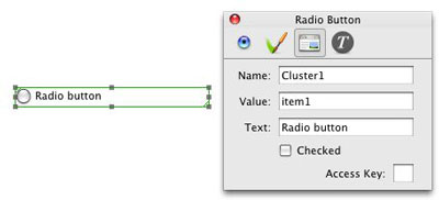
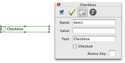
For the first method, click and hold on the HTML tool on Freeway's toolbar and choose either Radio Button or Checkbox. You can now draw an item on the page and the item will display with either a round radio button (with the text "Radio button" to the right of the button) or a square checkbox (with the word "Checkbox" to the right of it. If you select the item on the page and go to the Output Settings tab of the Inspector you will see that there are fields for Name, Value and Text.
By default, the fields for a radio button will be Name = Cluster1, Value = item1, Text = Radio button. See the screenshot below:
By default, the field for a checkbox will be Name = item1, Value is blank, and Text = Checkbox. See screenshot below:
To set up a list of checkbox options
The most common method of using checkboxes on a form is to ask the visitor to check one or more options so that the information is sent with the rest of the form information as an email. It can be used so that the visitor acknowledges that, for example, they have read the terms and conditions (in which case just a single checkbox is used) - but more often a list of checkboxes is offered on the form for the visitor to check one or more from the list.So the email sent by the form can give details of which checkboxes were checked by the visitor, each must have a unique name in the Name field of the Inspector's Output Settings tab. This can be simply "item1", "item2", etc., but it is best to give them logical names. For example, if you want to ask the visitor what their hobbies are, you can given them names such as "Watching movies", "Sport", "Photography", etc., so these names appear on the email that is sent. It is important to note that the text entered in the Name field is not seen on the page (or the browser), but it will be the identifier in the email which is sent when the form is submitted.
The Value field can be left blank, but you can choose to enter something like "On" or "Yes" if you want to specify what value is returned on the email when the checkbox is checked by the visitor.
The text you enter in the Text field is what will display alongside the checkbox in Freeway and also in a browser.
Below the Text field is an option called Checked. If this is checked in the Inspector's Output Settings panel, the form will display with that checkbox already checked.
There is another field at the foot of the Output Settings panel called Access Key. This is used very rarely, and you should only enter a value in the field if you need to use specialist "keys" for your form.
To set up a list of radio buttons
As mentioned earlier, radio buttons work in a very similar way to checkboxes. The big difference is that each group of radio buttons (which are called "clusters") need to have a unique name so the information sent by the form will show which option the visitor chose for each cluster.For example, if you want to ask the visitor two different questions - such as "Do you like fooball?" with a choice of Yes or No, and "Do you like hockey?" with a choice of Yes or No - you will be able to see which choice the visitor gave for each question. In this instance, you will need to use two radio buttons for the first question (with something like "Cluster1" entered in the Name field) and then two more radio buttons (with something like "Cluster2" entered in the Name field).
The Name value for each cluster can be anything, but it must be unique to each cluster.
The rest of the options in the Inspector's Output Settings panel are exactly the same as for checkboxes.
Using radio buttons and checkboxes as "inline" items
There is a slight difference to the options in the Inspector when using radio buttons or checkboxes "inline" (ie, when they are used inside a parent HTML item or by double-clicking inside a cell to line up the form items within a table).To use a radio button or checkbox as an inline item, you need to click inside the table cell or HTML item and then go to Insert>Radio button or Insert>Checkbox. This will show just the round radio button or just the square checkbox (ie, no text text will appear alongside it). With the radio button or checkbox selected on the page, you will see that there is no Text field in the Inspector - this is because an inline item cannot be made to display text in the same way as it does with a standalone item.
You will need to click inside the table cell or HTML item immediately after the radio button or checkbox, type a space and then type the text you want to appear next to the button/checkbox.
All the other options are identical for both.